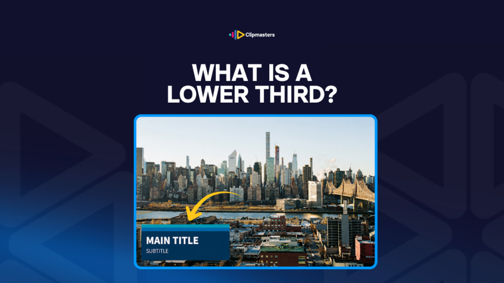
A lower third is the graphic that pops up at the bottom of a video to tell you who is speaking or to give a bit of context. The name comes from where it sits: roughly the lower third of the screen.
The classic lower third introduces a speaker. It appears as the person starts talking, shows their name and title, then slides away after a few seconds. Now the viewer knows who is speaking without the host having to say “this is Joke De Swert, CEO of Clipmasters.” The graphic does that work for you.
Lower thirds are used for all sorts of things:
The lower third lives at the bottom of the frame for a reason. That is where your eye usually has the least going on, since faces tend to sit higher up. So a graphic at the bottom stays out of the way of the main picture.
A few pieces make up a typical lower-third design.
The look of a lower third is a brand and production choice. News networks have their own distinct styles. Documentaries often keep them minimal and restrained. YouTube creators go bold, animated, and on brand. Good commercial work matches the lower-third style to the rest of the video’s design.
For a steady look across a whole series, productions usually build lower-third templates they can reuse. The fonts, colors, motion, and layout stay the same, and only the text changes. That keeps the work fast and makes the series feel like it belongs together.
Where you place a lower third matters for both how it works and how it looks.
For commercial and online video, the standard “appear, hold, disappear” lower third is the default. The persistent kind is saved for specific formats like live news, sports, and live data displays.
A few habits give away amateur lower-third work.
For commercial work, the lower third is one of those small details that quietly signals quality. A clean lower third with consistent fonts, colors, and motion makes a whole video feel more polished than the same video with a generic template.
Lower thirds are a small motion-graphics detail that punch above their weight: a clean, on-brand one can make a simple talking-head video feel professional, while a sloppy one undercuts even great footage. At Clipmasters, your editor builds a lower-third template that matches your brand once, then reuses it across your videos so only the text changes. That keeps the work fast and makes your content feel like one coherent series instead of a pile of one-offs.
Usually a name, which is largest, and a title or company below it in smaller text. Sometimes a logo or brand mark too. Two lines is the sweet spot, since more than that gets hard to read in the few seconds it is on screen. Keep it to the essentials: who is this person, and why is the viewer hearing from them?
Usually three to six seconds. Long enough to read the text, short enough that it does not turn into clutter. It should appear soon after the speaker starts talking and slip away before they are deep into their point. Some long-form content, like documentary or interview, holds it a bit longer, around eight to ten seconds, if there is more to read.
Higher than in horizontal video. The usual "lower third" spot can fall below the safe area on platforms like TikTok and Instagram, where the bottom of the screen is taken up by the platform's own buttons. For vertical video, move your name graphics up into the middle of the screen, closer to where the subject's face appears.
Yes. Most modern editors, like Premiere Pro, DaVinci Resolve, and Final Cut Pro, come with built-in lower-third templates you can fill in with your own text and brand styling. For more advanced work, After Effects gives you full creative control. And template marketplaces like Envato and Motion Array sell professional lower-third designs for most editors.
Traditionally yes, though modern designs sometimes use other spots. A side lower third, placed on the left or right, works well for talking-head shots where the subject sits on one side. Upper-third graphics show up now and then too. The bottom is the default, not a hard rule. The right spot depends on what is in the frame and what the platform's own buttons might cover.